 |
| Turn your photos upside down and this will help you see where your eye goes first. After seeing where your eye goes first, is this where you want you audience to look? Nikon D2Xs, ISO 400, f/7.1, Nikkor 24-120mm |
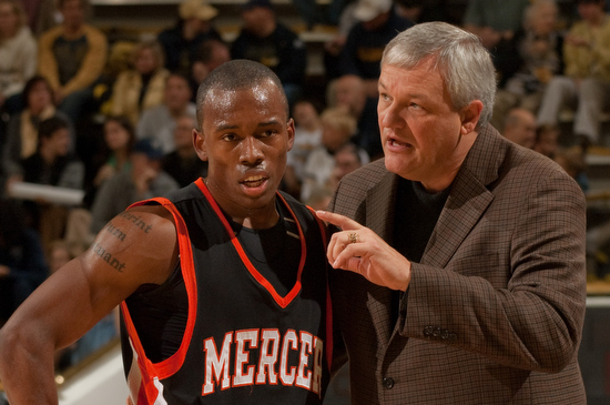 |
| Light values are one of the biggest factors in influencing where someone looks. Nikon D2Xs, ISO 400, f/7.1, Nikkor 24-120mm |
Start upside down
One of the ways I was first taught to look at a photo is to turn it upside down. This way you are seeing how the composition and light values of the photo will direct someone to what is important or away.
The light values alone have tremendous affect on the viewer. If you put a black dot on a white paper with nothing else or a white dot on a black piece of paper your eye is drawn to the dot.
With more stuff on the paper the principle is still the same the contrast of the light value to the rest of the scene will draw you to a spot.
Now that you know this you should then be able to help create a photo that directs the viewer just based on light values to the subject.
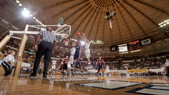 |
| The ceiling helps to add some graphic qualities to the photo. Nikon D3, ISO 400, f/7.1, Nikkor 24-120mm |
Graphics
Sign manufactures have used big arrows to direct you to a store location. You could use a huge arrow to show people where to look, or you can use this same principle in a more subtle way to direct the viewer.
Leading lines and perspective can help pull you into a photo and give the photo some depth.
While straight lines hit you over the head directing your eye the S-curve is a classic way to draw a viewer eye. One of the most common uses in scenic photo is the river winding through a scene.
Framing
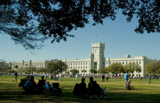 |
| Here I am using the tree and the people in the shadows as framing at The Citadel. Nikon D3S, ISO 200, 1/1250, Nikkor 24-120mm |
While a photo might look good in different frames you can buy at a frame shop you can also use elements in a photo to help frame the photo. This framing helps often create a sense of depth to a photo and not just border like a physical frame. Looking through a doorway to the subject in a room helps create some context.
 |
| Using the flowers to fill in what could be an empty space. Nikon D3, ISO 1600, f/5.6, 1/5000 Nikkor 14-24mm |
Flowers in the foreground and the subject like a house in the background help fill what would often be dead space in the photo.
Hey there’s more
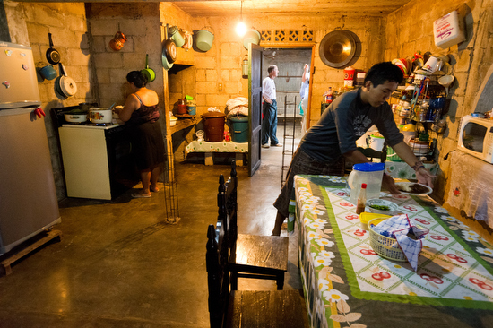 |
| While your eye may go to the young man first setting the table and it is telling a story, your eye most likely will drift to the woman at the stove cooking and then to the people in the back room. If I did it right then your eye will drift around looking at the smaller details because I got your eye moving and once it is it will explore. Nikon D3S ISO 12,800, f/5.6, 1/40, Nikkor 14-24mm |
You can make a nice composed photo of a subject and do a great job of creating a pleasing photo of the subject. You can also make a photo that is more storytelling and not just a pretty picture. These are photos that you may be drawn immediately to the main subject, but your eye continues to be moved around the scene and in so doing you are learning more and more about the story.
Some photographers have you looking only at the subject and not much more. The seasoned story teller will have you looking all around and absorbed into the content.
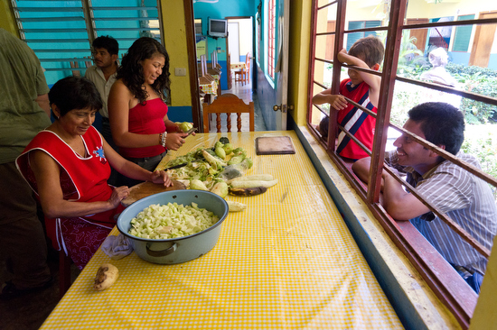 |
| Multi-layered compositions take time and really help tell the story in its context much more. It also is more entertaining, but requires the time for the audience to absorb. Photos like this need a longer pause in the slide show or video. Sometimes in magazine story spread you let them run over two pages to let the audience see all the action going on. Nikon D3S ISO 5600, f/5.6, 1/250 Nikkor 14-24mm |


No comments:
Post a Comment